Does a media-query affect specificity?
A while back I had a nice and healthy discussion with my colleague, about whether having a rule of CSS, wrapped in a media-query would affect specificity or not. I was pretty sure that a media-query didn't affect the specificity, but when we talked about it back and forth, I started doubting myself a tiny bit. So I decided to make a simple test, and I want to share the findings here, hoping someone can use it.
So let's have a look at a super simple example, that also gives away the answer quite clearly:
See the Pen media-query specificity by Mikkel Rom Engholm (@mikkelrom) on CodePen.
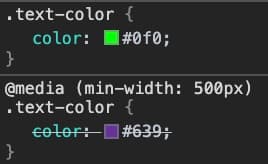
If we take a closer look at the CSS in Chrome dev-tools, we can also see that the media-query doesn't affect it at all.

Conclusion permalink
So there you have it, media-queries does not affect specificity. A media-query only decides whether the code inside it should be enabled or not.
In comparison, it's the same mechanism as for the media attribute for the the link-tag, the source-tag and the style-tag:
<!-- The link tag media attribute -->
<link href="style.css" media="screen and (max-width: 600px)" />

<!-- The source tag media attribute -->
<picture>
    <source srcset="/media/examples/surfer-240-200.jpg"
            media="(min-width: 800px)">
    <img src="/media/examples/painted-hand-298-332.jpg" />
</picture>

<!-- The style tag media attribute -->
<style media="all and (max-width: 500px)">
    p {
      color: blue;
      background-color: yellow;
    }
</style>
Read more: MDN - Media queries