The benefits of component libraries and when not to use one
Table of Contents
Benefits of using a component library
- #1 UI overview
- #2 Build components in isolation, to make them reusable by default
- #3 Variants
- #4 Ability to work offline
- #5 No local server configuration needed
- #6 No local database needed
- #7 No dependency on authenticated user data
- #8 No dependency on CMS data
- #9 Fast page-reloads
- #10 OS independence
- #11 No dependency on backend

Intro permalink
Design systems have been a hot topic for a few years now, and thereby also component libraries. But what makes them so special and what's all the hype about?
Why can't we just go on and build digital products the classic way as we have been doing it since the beginning of the web? I mean: You have a website. That website consists of some files. Then you either need to add a feature or fix a bug on that website, so you make your changes to the files and deploy them and you're done (very much a simplified version, I know).
What does the workflow look like when building in a component-library-first kinda way and what are the benefits? Aren't we just complicating things by having the UI components living outside of the "real solution"? (Spoiler alert: No, it's actually pretty AWESOME!).
I will get to the benefits of a component library and why you need it, but first - let's get the terminology straight, let me explain what I mean by a component and a component library.
What is a component? permalink
The exact meaning of a component can be many things, depending on the context. It basically just means a part of a bigger whole. What I typically mean by a component is a part of the UI, which can be either interactive or not, which means that it either consists of JavaScript or not. These are my typical definitions:
- UI components: HTML + CSS. This could be a button, a radio-button or an input-field or anything else consisting of just HTML and CSS.
- Functional components: HTML + CSS + JS. This could be an accordion, a carousel or a modal.
I typically have three general categories in the component libraries that I build: UI components, Functional components (I just mentioned these) and Styling. The Styling category contains documentation on those things that are not exactly components, but still very important. These are typically:
- colors
- icons
- typography
- shadows
- spacing
- utility-classes
These are very essential building blocks of a organised system, without these it becomes really hard to maintain consistency over time.
What is a component library? permalink
A component library is actually just one of the most recent names of something that has existed for many years. It has been called pattern library, style guide, UI kit, UI library or CVI (Corporate Visual Identity). Even though these are different and not exactly the same, they all more or less try to reach the same goal: Document the UI in one place, although a CVI and a style guide might focus more on documenting the broader visual identity, which might apply to both digital and non-digital.
A component library is a component workshop environment that frontend developers use to build and test their UI components (or entire pages or flows) in isolation.
The component library can be deployed so it's available on a URL so other disciplines in the team/organisation such as designers, UX'ers, backenders, architects, project managers or stakeholders can access it. When the component library starts to become something that many different disciplines, teams or people use and depend on, this is where (in my opinion) it starts to grow into being a design system. I'll get back to what component library you should choose in a bit, but first I'd like to talk about the (many) benefits of using one.
Benefits of using a component library permalink
There are so many reasons why it's great to use a component library - get ready, here they come...
#1 UI overview permalink
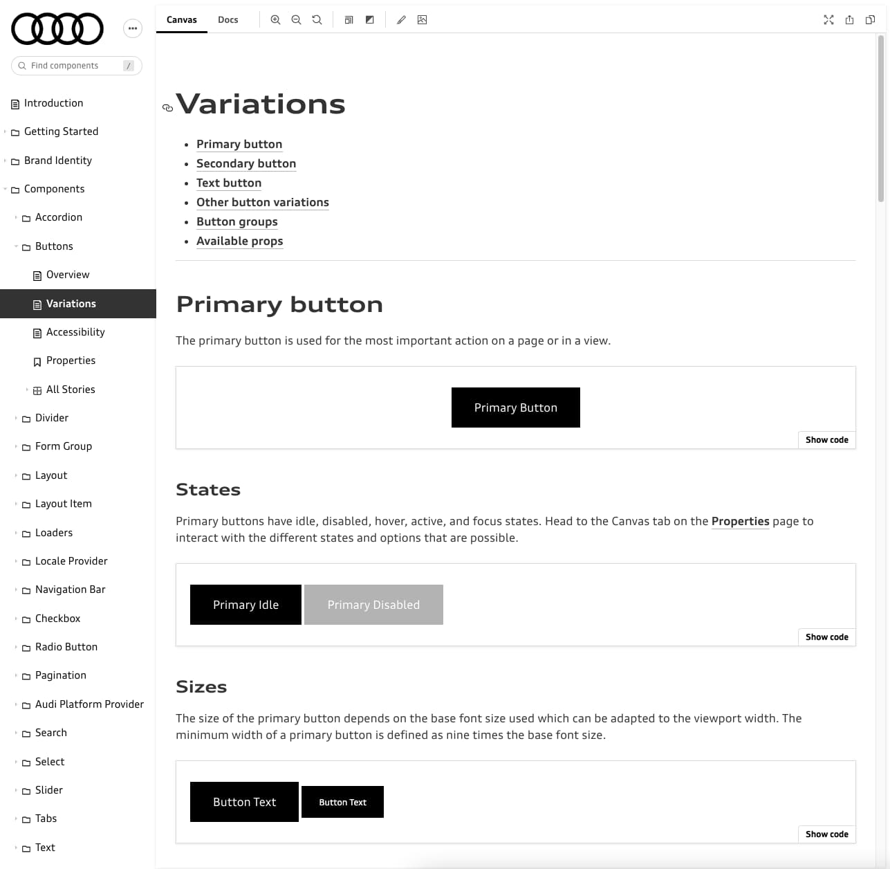
Having all components gathered in one place makes it very easy to get an overview of the entire UI. Being able to search for a component and see all the different states and variants of that component is just super essential, especially when a new developer joins the team. Having the overview makes onboarding much easier and faster - and therefore also cheaper.
Example of Audi's Storybook:
#2 Build components in isolation, to make them reusable by default permalink
Example of building the classical way (inside the real solution):
Let's say you get a design from a designer for a new page. When building one of the components needed, you add the CSS that makes it match the design on that page. All good, job is done!
A month later the designer creates a new design for another page using the same component you built, but with a few modifications. Only this time it's assigned to your colleague (which accidentally is located in one of the other offices in your organisation), because he/she had time available for this task. Your colleague solves the task in the same way as you did, because he/she didn't know about the component you had already build. Now you have two very similar components in the same product leading to unnecessary bytes for the end-users and unnecessary code to maintain for the team.
This example is perhaps a bit too far-fetched, but nonetheless it's not entirely unrealistic. If people don't talk together, don't do regular code-reviews and so on - then it's hard to know about all the features and all the parts of the application.
This is where a component library can help out. When creating a component in a component library, it's created in isolation from the beginning. When it's created in isolation, you make sure that it's:
- reusable from the beginning, since it's forced to work outside of a certain page-context
- you make sure that it's visible to other developers in the team, so they don't end up building the same similar component, but instead consider if they can reuse and/or extend the existing component. This saves time and money in the long run.
Of course component libraries doesn't solve all problems. Communication and code-reviews are still crucial, and having one place for all components helps that process and makes it easier.
#3 Variants permalink
By adding multiple variants you can document how the component behaves in different scenarios, this will surface edge-cases and hard-to-reach use-cases, resulting in more robust components and less bugs. This is a huge benefit! It's also just really nice to flesh out all the (relevant) possible props-combinations so it's easy to see what your "available LEGO bricks look like".
Examples of variants of a very simple button could be:
- Primary
- Seconary
- Small
- Large
- Disabled
- Icon
- Long text
The "Long text" variant is great at showing how the button handles a lot of text. Does the button have a maximum width? Will it truncate the text, and does it add an ellipsis (...) if truncating? Does the text go into two lines? We don't know - this is why it's great to show it.
I often compare component variants to unit tests, even though they are not exactly the same, I still think they share some common concepts. The job of a unit test is to make sure the code works as expected and to document all weird edge-case scenarios. These are some of the same reasons you would show-case a component and all it's variants in a component library.
When talking about states and variants, I can highly recommend this must-read to both developers, designers and UX'ers. It's about making sure to make design-decisions up-front, instead of pushing them on to the frontend developer, it saves a lot of time to have common UI states defined in the design from the beginning instead of forcing the frontend developer to chase those states from the designer when building. It also serves as a nice checklist. "The Nine States of Design".
#4 Ability to work offline permalink
You are (simply put) just working with JS, CSS and HTML files locally, so in most cases you can actually work offline (except when uploading/downloading the source code). You also don't need to connect to a special network through the company VPN. This is nice if you occasionally need to work in an environment with a spotty connection such as an airplane or on a train.
#5 No local server configuration needed permalink
Don't spend time on configuring the backend on your localhost server, instead just pull down the sourcecode, do an npm install and then npm start (or something similar) and that's it. You can now see the entire component library and all the weird edge-cases and states of the components. It's all documented right in front of you.
#6 No local database needed permalink
No dependency on the data from a database, since you're in control of the data. The data is hardcoded, and that's 100% fine. The component library is UI documentation, so it best to keep the data hardcoded (even though it's hardcoded it can still be DRY by extracting and organising the data so it's reusable).
Now you are not blocked by a team-member making big changes to the shared team database that impacts your work.
#7 No dependency on authenticated user data permalink
No need to dig after credentials for that one special test-user that has this very edge-case profile-data. Again, this is not an issue since you are in control of the data and are able to create the component variants you need with whatever data you need in order to document that piece of UI as best as possible.
#8 No dependency on CMS data permalink
No need to spend time in the CMS adding a specific component to a specific page on a specific language, just to be able to see something rendered in the HTML. You can start working on the frontend component right away in the component library, and when you're done you add the finished component to the CMS.
#9 Fast page-reloads permalink
Often times when working in the "real solution" on localhost, it can have very long server-response times, which can be very frustrating, since you just wanted to see that your latest change in the CSS/JS/HTML comes through, and it honestly shouldn't be that hard. I have experienced page-load times around 1 minute and when you're working with CSS as I often do, you probably want to reload the page quite often to see those changes in the browser, and then that 1 minute refresh adds up extremely fast. Plus all the mental frustration caused by the feeling of being blocked or having to wait. Of course we as people tend to adapt, and maybe we actually bundle our changes before doing the reload, but the point is, it's very inefficient.
A component library typically provides almost instant reloads, because it has no dependencies to a backend or a database - just pure frontend. Sometimes you can't even switch windows fast enough to see that the page reloaded! ⚡️
#10 OS independence permalink
Being able to run just the frontend-part of a project which doesn't care if it's running on Linux, Windows or Mac, is actually really nice. IMO it's more inclusive and effective that way, not forcing frontend developers onto an Operating System in which they might be less productive or feel less comfortable with. It can be frustrating having to switch between different OS's and re-learn keyboard shortcuts.
#11 No dependency on backend permalink
Sometimes it's not possible for frontend and backend to work on the product at the same time, due to other projects or maybe because of planning, or maybe the team prefers to do backend-work and frontend-work in a certain order.
With a component library the frontend is separated from the backend and the business logic. So the frontend-people can actually start working on UI components before the backend-work have even begun. It makes sense to begin prototyping on HTML-components together with the designer and/or UX'er as early as possible. A component library makes this possible.
Just to be clear: I'm not advocating for frontend-silos and backend-silos here, I'm just saying it's nice to be able to work without depending on each other from the beginning. That said, frontend-people and backend-people should always have a very close dialog all the way through a project and agree on things like how the data should look and what API endpoints are needed and so on.
Which component library should I use? permalink
This is a short story of my personal experience through different methods and tools.
Single HTML-page permalink
My first encounter of a UI documentation system was Bootstrap around 2012 or so. This might seem like a bad joke, but it's actually the first time I saw an organised system for UI components, and it worked great at the time. Later on I saw projects that had build their "own custom bootstrap"s and it was named something like UI kit or style guide, it was typically just a simple HTML-page (as in 1 file only) with all the homemade UI components listed downwards. It doesn't get much simpler than this, and this method makes it very easy to get going. Unfortunately this way of documenting UI has a few challenges. First thing, it doesn't scale very well. It quickly gets heavy if you add components that contain video embeds or iframes. Also, if you have just one video with autoplay, it will drive you nuts 😉. As the number of components grow, you will quickly find yourself in the need of some sort of navigation around the components.
Patternlab permalink
My next encounter was Pattern Lab. This was much more scalable than a simple HTML-file, because it had a menu structure. It also had a bunch of nice features such as search and a way to resize within the tool without opening dev-tools or resizing the entire browser-window. I have used this a lot.
Fractal permalink
Next I discovered Fractal, which was much like Pattern Lab, but it let you decide which templating language you wanted to use, i.e. Handlebars (default), Mustache, Twig, Nunjucks or even your own custom one. Pattern Lab (back then at least) only worked with Mustache, and I liked the ability to have the choice. It also had (In my opinion) a nicer looking UI than Pattern Lab.
Storybook permalink
Last, but not least I learned about Storybook. I think of Storybook as a component library, but they promote it as a "tool for developing UI components in isolation" themselves. Brad Frost, the author of Atomic Design and also the founding father of Pattern Lab is saying this about Storybook:
Storybook is a powerful frontend workshop environment tool that allows teams to design, build, and organize UI components (and even full screens!) without getting tripped up over business logic and plumbing
— Brad Frost
At first I must admit that I was a bit hesitant to jump right into it, since IMO in the beginning Storybook was a tool very much targeted at React developers (which I'm not) and you as an author needed to write a lot of JavaScript just to get anything into Storybook. In comparison, it was very easy to add a component in Pattern Lab and Fractal, just add a templating-file in a folder and you're done. But luckily, later on Storybook became very inclusive to other frameworks than React. It now supports Vue, Angular, Web Components, Ember, HTML, Svelte and Preact and people with a more CSS-ish background than JS, which is great.
At this point in time I really like Storybook and the way it's headed, also with the support of the MDX format, which lets you weave interactive components into markdown - which is a match made in heaven in regards to UI documentation. Another very important thing to mention about Storybook is it's popularity. There are over 1000 contributors and more than 8 million installs per month. There are also a lot of addons.
Storybook is really good at handling variants which is called stories in Storybook (I often call it "variants" - it was called that in Fractal, and it stuck with me 🙃 ) and they are very easy to create.
Super simple example showing a button component with a Primary variant/story and a Secondary variant/story having two controls: cssClass and buttonText.
export default {
    // Name and location of the component in the Storybook sidebar menu
    title: "Design System/Components/Button"
};

// Reusable template
const Template = (args) => {
    return `<button class="c-button ${args.cssClass}">${args.buttonText} button</button>`;
};

// "Primary" variant/story
export const Primary = Template.bind({});
Primary.args = {
    cssClass: "c-button--primary",
    buttonText: "Primary"
};

// "Secondary" variant/story
export const Secondary = Template.bind({});
Secondary.args = {
    cssClass: "c-button--secondary",
    buttonText: "Secondary"
};
Recommendations for a Storybook setup
Besides the preinstalled essential add-ons I would recommend you to also look at Accessibility and HTML Preview add-ons.
The Storybook team made some really nice components in the Docs addon that can be used in MDX. Example of ColorPalette, IconGallery and TypeSet:
# Colors

<ColorPalette>
  <ColorItem
    title="theme.color.greyscale"
    subtitle="Some of the greys"
    colors={['#FFFFFF', '#F8F8F8', '#F3F3F3']}
  />
  ...
</ColorPalette>

# Icons

<IconGallery>
  <IconItem name="add"><ExampleIcon icon="add" /></IconItem>
  ...
</IconGallery>

# Typography

<Typeset fontSizes={['12px', '14px', ...]} sampleText="Heading" />
Read more: https://storybook.js.org/blog/rich-docs-with-storybook-mdx/
Which component library should I use?
You probably guessed it by now... Storybook is my preferred tool of choice, so it will be the tool I would recommend right now, but who knows... that might change in the future 😉
This was a little tour through my experiences with different kinds of component libraries, hopefully it was helpful. If you know and love a component library that I didn't mention, please let me know.
Should I deploy it? permalink
Is it a good idea to deploy the component library to a URL (either public or semi-public hidden by a VPN or password-protection), so other that developers in the team can see it?
Yes, you should deploy it if you can say yes to one or more of these:
- You're doing the frontend-work, and other people are doing the backend work, using your frontend-code or UI components. It's great to have a URL that points to a single component that you can send to a backender for reference.
- You're working closely with designers and/or UX'ers
- Someone in the organisation (QA, project manager, stakeholder) would benefit from having the component library available on a URL, instead of it only being a localhost-only-for-developers thing.
BUT, in any case, you shouldn't spend time on setting up deployment in the beginning. It's better to wait until the component library is matured a bit and has something in it. Until then, you can share your screen or record screencasts to the people that are interested in seeing it and following the progress. When needed you can investigate what kind of effort it would take to actually have it deployed somewhere.
Storybook has a build-storybook command that will generate static files to a folder. Read more here on how to deploy Storybook. I can recommend Netlify or Azure for hosting your component library as a static website. Chromatic by the Storybook maintainers is also an option.
When should I NOT use a component library? permalink
If you're starting a new project, for example a campaign or a brochure site, and you know for sure that it wont live for long, maybe only a few weeks, a few months or under a year, and if you're not comfortable with this way of working, then I wouldn't recommend it. Then I think it's fine to be pragmatic about it and just treat the entire project as a one-off thing.
In scenarios where you are working on a long-term product, where you know that you will be maintaining the components at least several years from now, it's a great (and cheap!) investment to start building the components in a component library. It will probably save your bacon in the long run 🥓
What's the hardest part? permalink
It's fairly easy to set up, the hard part is actually the processes around it. Because once you have it set up and you have your components organised and documented in a nice component library, this is where it's important to agree with your co-developers in the team (assuming you're not in a lone-developer situation) how the process should be. I recommend a CLF approach (Component-Library-First - I just made that up btw, lol), which basically means that:
- New features: Every time a new feature or component is to be developed, it happens in the component library first, and then when that frontend work is all done and great (all relevant component variants/stories are created), then that component is implemented in the "real solution".
- Bugfixing: Every time a bug is going to be fixed, it happens in the component library first. When it's fixed in the component library, then the changes can be implemented in the "real solution". And YES - it's true that in some cases the bug is not reproducible in the component library due to different reasons (HTML being out of sync, probably). In this special case, fix it in the "real solution" and then make sure those changes are also reflected in the component library. Bonus-points if you are able to create a component variant that simulates that scenario that caused the bug in the first place. "But isn't that very much like the best-practices when doing unit-tests?" you might ask... YES, it is. There are IMO many similarities between component variants in a component library and unit-tests.
If you are choosing not to go with the CLF approach, then you will (Murphys law) run into situations where your component library and your "real solution" is out of sync - and you don't wanna go there, trust me on this 😉
Of course it's a lot easier if you can start a project this way, instead of having an existing project (maybe even an old project) and trying to copy HTML into this new structure and way of work. It can be a lot of work, but as mentioned earlier there are also many things to benefit from, so in the long run it could be a good investment.
Conclusion permalink
The ability to remove distractions and dependencies like databases and servers and really focus on the frontend craft itself is something that can really boost efficiency and save a lot of money. Reducing the time it takes to reload the page or even to onboard a new colleague by having a great overview of the entire UI, frees up time to go and build a great UI and an even better user experience for the end-user. Time saved on setting up the local environment, could be used on making the product more accessible, more secure, more performant or adding some smooth animations or nice-to-have features, making the product even more lovable.
So go on, try out Storybook or another component library if you haven't already - and start saving time and improving your digital product. 👊
✨ Get inspired by all these great examples of public design systems and component libraries: http://styleguides.io/
📱 Tip: If you're building UI for more than one platform, you might wanna look into Design Tokens.
👋 Did I miss anything or do you have thoughts on these topics? Let me know: https://twitter.com/mikkelrom